Case study: Crafting a Lego mobile game experience
When working with an iconic brand known the world over such as Lego, the principle goals & biggest wins in crafting a digital gaming experience undoubtedly go beyond neatly arranged layouts & efficient flows, or dunks on the competition & how well it monetizes.
There were still countless decisions made about every screen and interaction point, aimed at making a great interface for a mid-core (read: complex) game feel effortlessly usable — allowing the brand to shine above all else. But with Lego Legacy: Heroes Unboxed, I think it’s also worth sharing an inner look at the design thinking behind some of the more ephemeral & qualitative aspects of the experience design as well as some of the subtle interaction wins. Here are some of those insights from my 3+year journey as the sole UX designer of the project.
The Challenge
Lego already has a lot of ‘little pip’ content in their digital media offerings with kid-focused console games and TV shows, but the global success of 2014’s The Lego Movie, with its more adult ‘meta’ humour, struck a chord with a wider audience of both kids and notably a lot of adults. This showed our studio that it was possible to collaborate with the Lego brand to make a game that resonated with an adult audience.

This is important because the free-to-play business model relies on users having a strong engagement with the product, enough to want to spend their time & money in the experience, and little pips are not the primary target audience for AAA mobile gaming — the bigger bricks with disposable income are. Fortunately, a brand that has been at the forefront of children’s play for more than half a century means a lot of adults have fond childhood memories of Lego from the ‘70s, ‘80s, and ‘90s, so we just needed to recapture their love for the brand through an engaging game experience.
Capturing high-level brand values based on emotional qualities like nostalgia, charm & creativity was the key to a successful partnership between modern mobile gaming & the monumental Lego landscape.
A Winning Formula
Nostalgic & Modern Lego Toys
+ The Lego Movie-esque Charm
+ Bankable Gameplay Loop
+ Accessible to Kids & Lego Fans
+ Engaging for Genre Veterans
= Lego Lego: Legacy Heroes Unboxed
Showcasing the Tactile Play of Lego
The primary goal of the game’s experience was first and foremost to let the 60+ year legacy of Lego toys and the joy this brand has brought to so many people worldwide be a through-line in a new and different application of the IP.
We wanted to see moments of fun in some of the main showcase interactions with the brand’s core products, the Minifigures and the Sets, so we created immersive spaces to display a wide array of classic, vintage, and newer Lego, letting players get up close and personal with the digital facsimile of the tactile originals.


Empowering a Broad Audience with Accessibility
Many multiplayer turn-based RPG games work with AAA brands like Star Wars, Marvel, and DC, and draw in primarily male audiences, aged 18–35. These players often play more than one game in the same genre, and become experts at this genre’s style of complex system design. We anticipated a large portion of our audience would be these players, but we also expected that partnering up with the Lego brand meant younger and more casual player audiences would be drawn to our game through our license.

The goal was to make an experience that could be delightful and accessible to players not familiar with this genre’s gameplay — while also offering in-depth interaction & information for strategic players seeking a more typical genre experience.
UX & UI worked closely together to craft an information architecture that felt inviting & accessible, while making our chosen game genre’s underlying, elaborate systems design feel unobtrusive to the user until they chose to delve into a deeper level of the hierarchy.
Maintaining Consistency to Foster Familiarity
Everyday digital products like apps and websites often provide users with a wealth of content, options & features, all available to them at the outset. However, once users start to hone in on what they need from that experience, the number of choices, interfaces, and flows they interact with regularly will start to narrow; their familiarity with the experience and their habitual grooves grow, as the seeming complexity of all available actions shrinks, effectively.

A lot of mid-core games I’ve learned are a totally different beast. In fact, they’re the inverse: we start the player in a guided tutorial that is a narrow slice of the basic experience & core mechanics, unlocking new features and interaction mechanisms over time so they learn the extensive systems gradually and don’t feel overwhelmed early on. Eventually, players who play a game daily for months or years get into habits and routines as familiar as brushing their teeth, but a lot of player churn can happen if we don’t successfully get them comfortable & habituated with the entire ecosystem.
An important responsibility of UI & UX was to keep the experience, interfaces, information architecture consistent & familiar across many diverse systems, so players can easily get in a flow traversing from screen to screen and feel like they have a solid handle on what we’re offering them.
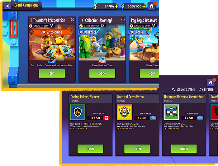
We took extra care in creating a design system with highly modular interfaces that could be flexibly used across more than 50 unique screen & popup layouts to keep core information & interactions familiar and comfortable to players as they delved deeper and deeper into the game.
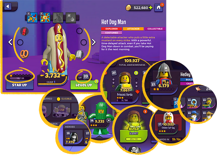
Atomic Hero Indices
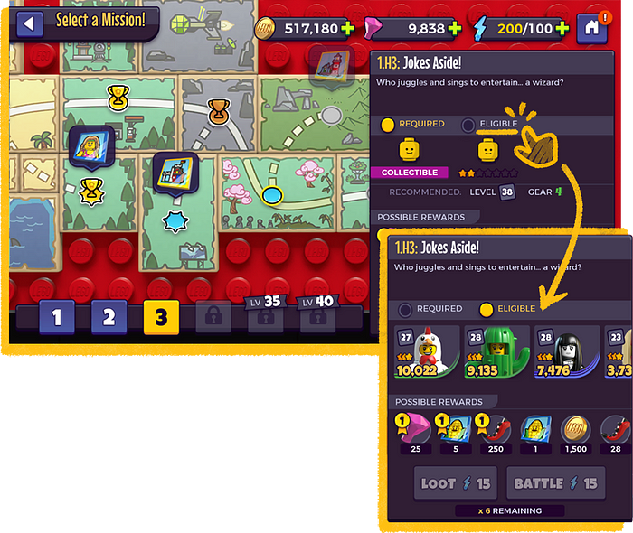
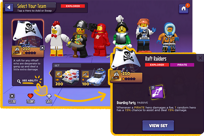
Minifigure heroes have 4 main quantifiers to represent their progression: their star rating (and a progress bar for the required amount of resources to upgrade this rating), their training level, their gear level (and the 6 gear items required for each level), and an aggregate number of all their stats shown as an ‘awesomeness’ number. Sets similarly have a star rating, an awesomeness number, as well as a special tile to represent their special ability.
We needed UI to represent these two main collectibles in the majority of features, often showing them in long lists, in more than 1 state, and in very small spaces. So we came up with a kind of atomic design system — a 2D portrait or 3D model; a name; a specific, curved backer; the 3–6 quantifiers— that could be arranged in different combinations and sizes to form design ‘molecules’ that best suited the needs of a feature. Even with so many variants of this information seen around the game, a consistent treatment made them recognizable in the context of any other UI and allowed players to always have the pertinent information they needed to make decisions about their teams easily.
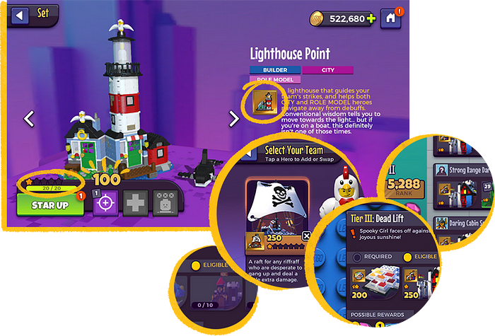
Primary Display Panel
A compact and standardized space to convey details & interactions on any screen — on its own where it takes up less than half the screen space to allow the majority of real estate for colourful & fun Lego-branded content, or in a list where in a horizontally oriented game, you can see 3 groups of information on screen at one time.
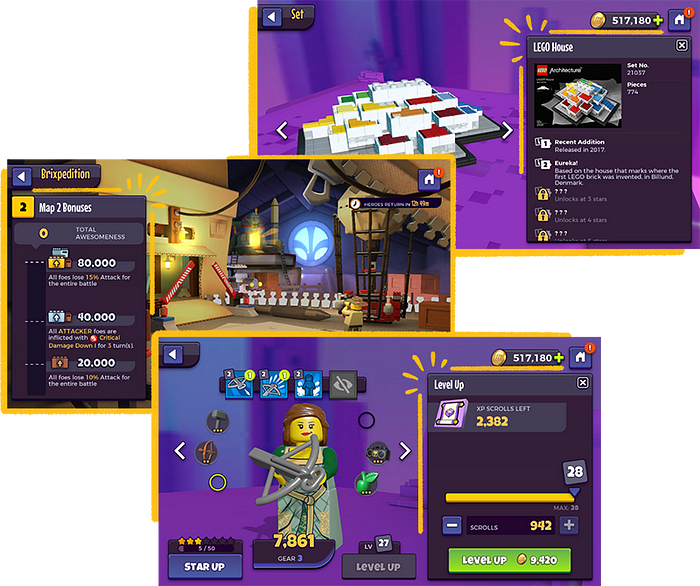
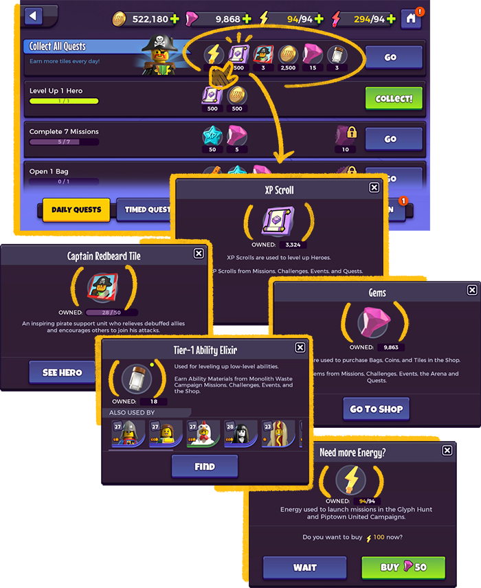
Resources
There are over more than 30 unique types of resources in the game, with multiple versions and rarities of many; we needed players to feel comfortable to question information to help them learn the systems. We maintained a rule that anywhere a resource is displayed, the UI treatment would be consistent to always denote it as a resource, and it would always have a tap action that opens a popup with a definition and information pertaining to it.
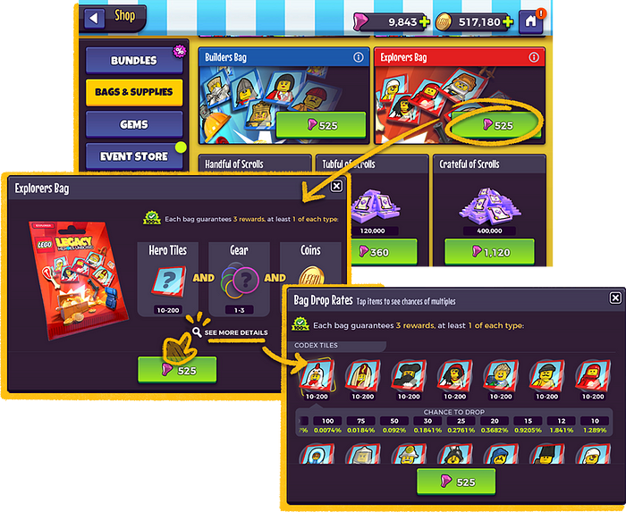
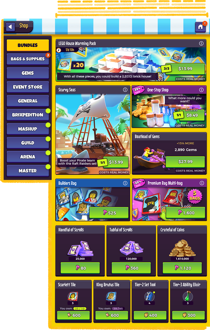
Shop Grid
We needed to be able to sell a variety of items in one shop, some requiring splashy cover art, some having nothing more than an icon, and sometimes showing time limits, purchasing restrictions, or sale prices. We developed a 12 column grid system with an item frame that could accommodate all the changing variables, remaining consistent in each tab of the shop so it all felt homogenous, in spite of the many differences.
Reflection
Making a new Lego game for the mobile free-to-play market has been a journey of discovery — of rediscovering the fun in Lego’s brand; of discovering all the shapes and sizes that Lego fans come in; discovering how complex and easily confusing a Multiplayer Turn-Based RPG genre experience could be; discovering ways to think outside the box for better accessibility and engagement.
After 3+ years, we finally had crafted a holistic experience that fit the brand, appealed to our wide target audience, and allowed for depth & complexity without intimidating the users. I really pushed for us to take the time needed to make sure that the experience was meeting our goals throughout the UI style, the design language, the information design, the micro-interactions, and all the little extra touches that make the game special.
Even though I’ve been a lifelong gamer myself, I learned so much working in AAA mobile game production, and it has given me a totally different perspective on user experience through the lens of gaming. Gamers often demand more from an experience than just having clean, efficient flows and layouts — ‘fun’ can certainly be a hard goal to quantify for practical applications — and the challenge of undertaking the immense complexity of a genre unfamiliar to me made me much more confident in my ability to conceptually and practically tackle large systems.
Shoutout to the whole team of 60+ people who made this game come together — the game experience as a whole is one created from so many disciplines and stakeholders other than myself, and I couldn’t have helped guide the UX on my own (let alone in the 4 major iterations we went through together) without the invaluable input from my peers and our leads. Cheers.

